EV Charging Case Study
Product Design & UX

This is a real enterprise project in the EV charging domain. The visuals here are demo variants to illustrate my process. The authentic product is available via a password-protected walkthrough Email me for access
Executive Summary
66% of users needed support to charge; no partners adopted, limiting trust and platform scalability.
Led 7-week UX sprint, owning Mixpanel schema, data filtering, UI kit, prototypes, and engineering handoff.
Support requests dropped 66%→16%, chargers scaled 400→7000+, partner adoption grew 0→6 in one month.
Reduced support costs, accelerated user activation, and delivered white-label flexibility that drove partner adoption.
Challenge
Customers needed support
to charge
Technical capacity, little
real usage
No partner adoption,
no market trust
Mixpanel Events
{
  "experiment": {
    "n": 550,
    "cohort": "new users (signup cohort)",
    "timeline": {
      "baseline": {
        "label": "Pre‑redesign",
        "weeks": 4
      },
      "post": {
        "label": "After launch",
        "weeks": 6,
      }
    },
    "source": {
      "tool": "Mixpanel",
      "events": ["charging_started", "charging_closed"],
      "cross_referenced_with": ["support_ticket_opened"]
    }
  }
}Customers needed support
to charge
Technical capacity
partner adoption
in 1 month
Product Design Approach
To break the deadlock, I leaned on IBM Enterprise Design Thinking. Why? Because it let me balance business constraints with real user needs—without letting either side dominate.

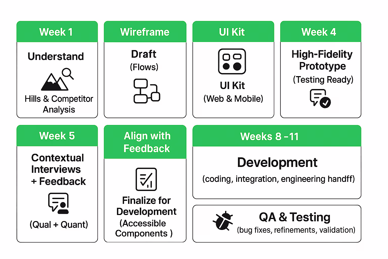
Execution Timeline — Product Design Sprint
The seven-week plan balanced speed with depth — giving stakeholders time while testing decisions with real users. This ensured every design choice aligned business goals with user needs, avoiding costly rework and wasted development cycles.
Setting the Vision
I defined four core “Hills”:
- Reduce Time of Task Completion: A real estate manager or individual can seamlessly complete key flows—charging, data observation, management, billing, and session sharing—quickly, confidently, with clarity and compliance.
- Improve Findability, Navigation & Search: A user can discover, start, and complete a charge without dead ends; a manager can reach critical reports without external guidance.
- Improve Accessibility: The new platform should be able to handle large amount of complex data, at the same time improve flow accessibility.
- White Labeling for Multiple Brand Identities: Any partner can apply brand identity through tokens/themes without breaking usability or a11y.
These Hills set the north star for all design decisions.

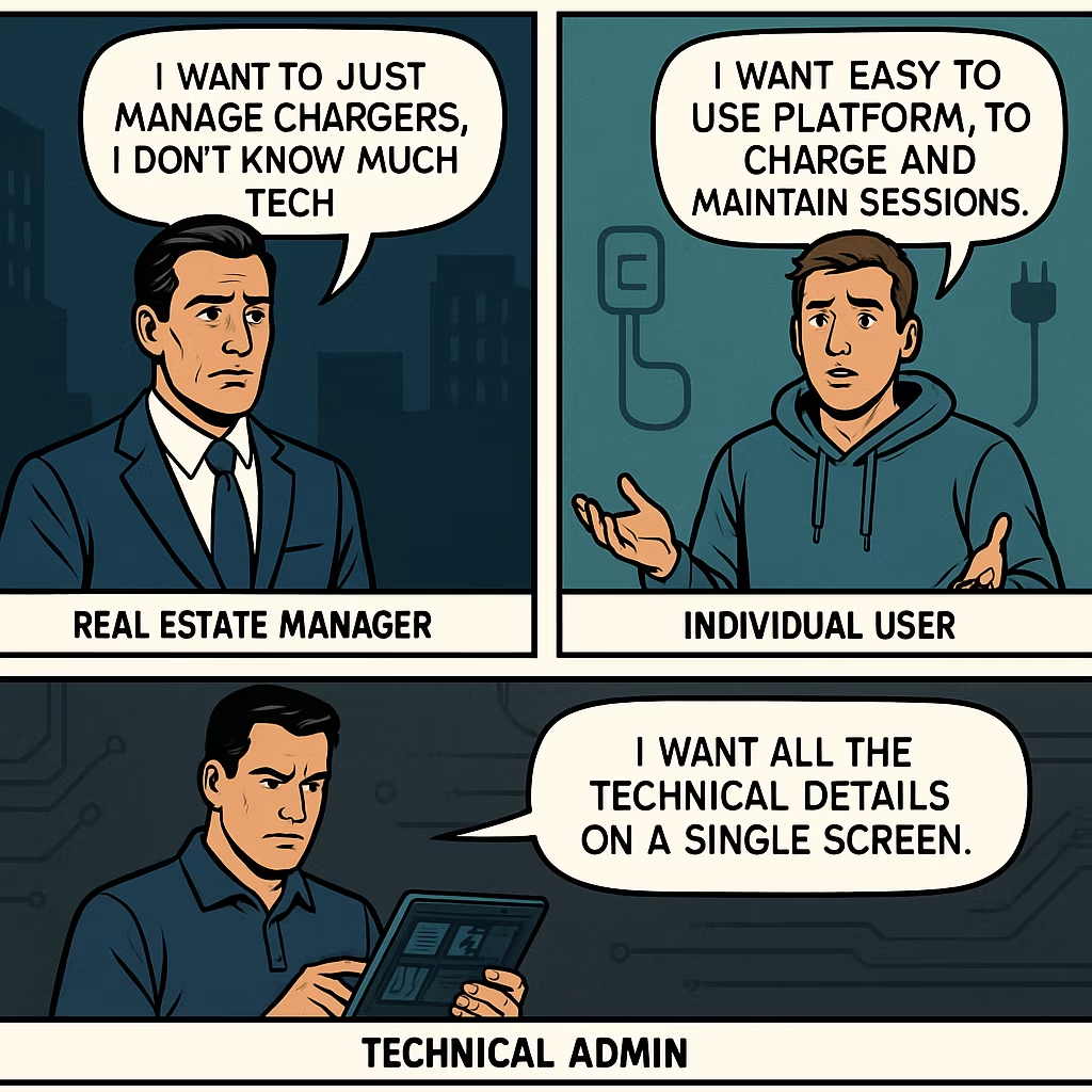
Research & Sponsor Users
To ground Sintio’s redesign in real needs, I worked with Sponsor Users — participants who partnered throughout the project and provided ongoing feedback.
- 2 Stakeholders
- 3 Real Estate Managers
- 2 Individual Users
I conducted one-on-one interviews, contextual where possible, from managers, drivers, and stakeholders. Each session used open-ended questions to uncover setup frustrations, charging journeys, and business expectations. To synthesize, I created an affinity map that clustered insights into themes, making it easier to spot patterns shared across roles. This process surfaced the most pressing pain points and guided us toward the features and flows that would deliver consistent value for all user groups.

Platform Audit
Parallel to interviews, I conducted a heuristic audit of the existing platform, walking through core flows while empathizing with the pain points surfaced in research.
- Usability gaps: The platform reused similar visual styles for elements with completely different functions — for example, the primary charging button and the subscription badge looked identical.
- Utility Gaps: Key features were buried across multiple pages, creating a utility gap — users often assumed the functionality didn’t exist at all. This not only reduced task success but also drove up customer support requests as users sought help for features that were technically available but effectively invisible.
- Lack of Signifiers: The interface lacked clear signifiers to guide non-technical users when switching between different spaces. Without visual cues, users struggled to understand context changes, which made managing chargers unnecessarily confusing and error-prone.

This is a real enterprise project in the EV charging domain. The visuals here are demo variants to illustrate my process. The authentic product is available via a password-protected walkthrough Email me for access
This section showcases the Old UI of the platform & utility issues. Protected under NDA.
Request Access →
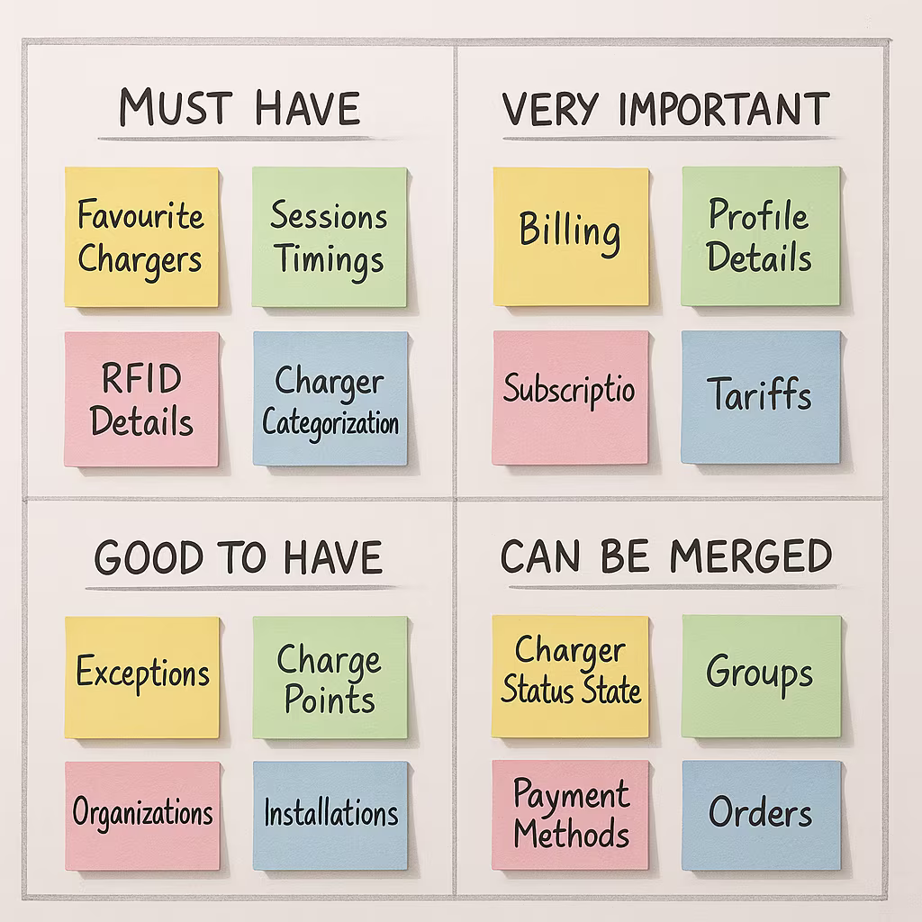
Filtering Data
I stripped the screen to what people need first and made cues impossible to miss. Goal: speed and clarity—result: faster first charges and fewer “how do I…?” tickets.
First, I pulled everything on the screens into one list and asked a simple question: who needs this, when, and why. Using sponsor-user input (drivers, real-estate managers, stakeholders), I cut duplicate or low-value data, merged rarely used views, and tiered the rest by task urgency. Drivers saw favourites, session timing, and RFID up front; managers got billing, subscriptions, and tariff controls one tap away. Clear labels and states replaced guesswork. The cleaned information model let us introduce differentiators—charger categorization, status hubs, and quick-actions—without adding noise. Net effect: less to think about, faster first charge, and a product that feels useful.
Interactive Prototypes
I kicked off wireframing with the tech in mind: spun up a real component scaffold using shadcn/ui, then refined tokens, states, and patterns for the platform’s needs. That let me assemble flows fast into interactive wireframes, and within days evolve them into a click-through prototype that felt close to production. We synced frequently with sponsor users—short sessions, decisive tweaks—so direction stayed honest, utility stayed high, and momentum stayed fast for engineering.
This section showcases the wireframe & prototypes of the redesign. Protected under NDA.
Request Access →
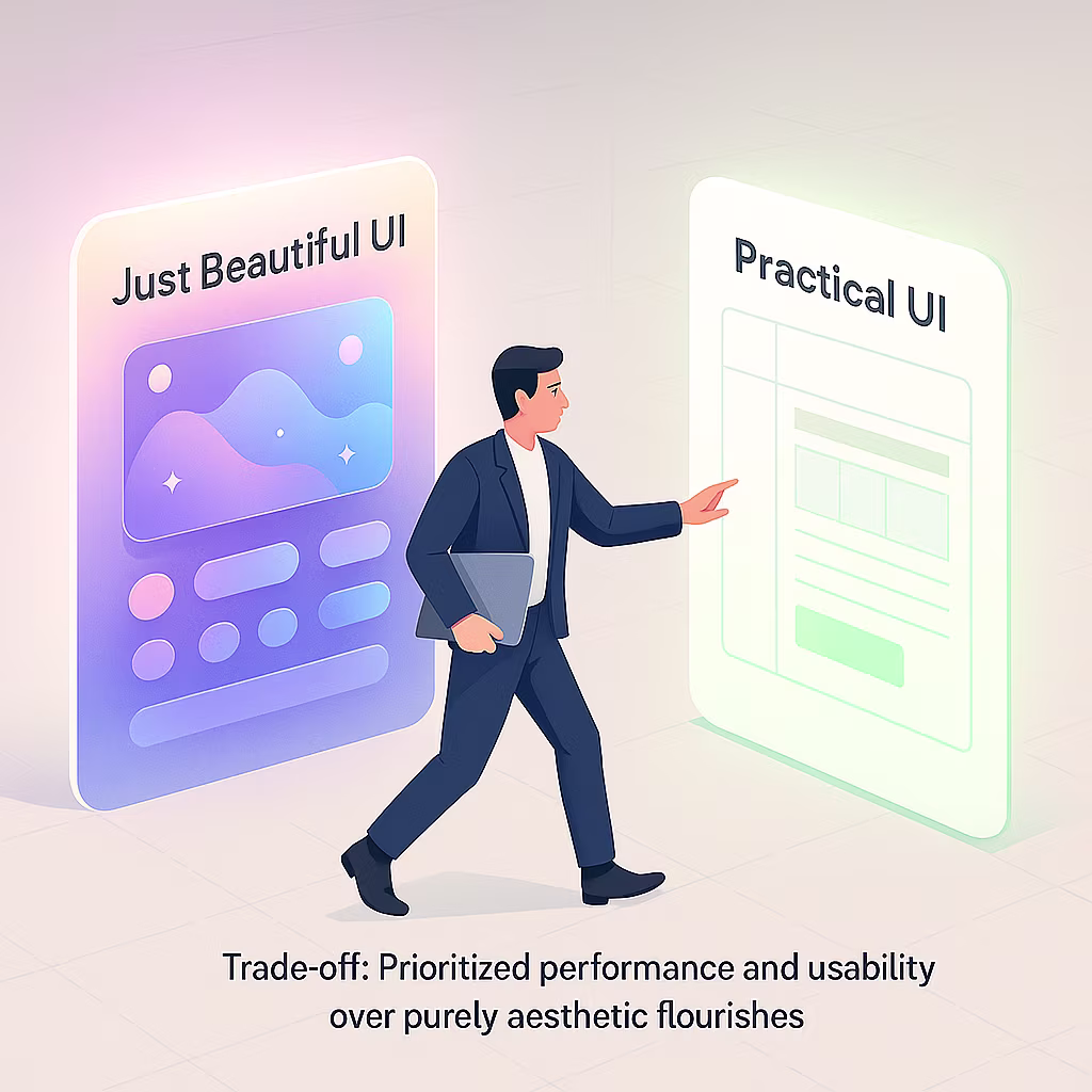
Constraints & Trade-offs
- Data vs speed: Prioritized fast loads over flashy motion; server-rendered key info, lazy-loaded extras, skeletons instead of spinners, and only lightweight, helpful micro-cues.
- 4 languages: Built length-tolerant layouts for DE/NL/FR/EN; auto-wrap/truncate with tooltips, min/max widths, and pseudo-localized testing so long French/German text never breaks.
- White-labeling: One consistent structure themed per brand via semantic tokens; swap logos/colors within contrast guardrails while keeping spacing, IA, and component behavior stable.
- Admin density: Default “Essentials” view with progressive disclosure; configurable columns, saved views, compact mode, and virtualized tables to show more data without overwhelm or lag.
Accessibility & Edge Cases
- Users couldn’t copy values because each row acted like one big link. I split interaction to cell-level, kept text selectable, added clear focus states and full keyboard support. Now people copy, tab, and click confidently without misfires.
- Admins managed 5,000+ chargers and wasted time scrolling to reach pagination. I made pagination sticky (bottom and optional top), with labeled buttons, jump-to-page, and aria-current. Page changes are immediate—no marathon scrolling, better productivity for admins and support.
- Recurring charger edge cases hid in old logs, slowing triage. I codified them as compact text+icon badges with tooltips and filters. Minimal space, maximum clarity—admins spot faults, maintenance, tariff pending, or stuck sessions instantly without opening detail pages.
This is a real enterprise project in the EV charging domain. The visuals here are demo variants to illustrate my process. The authentic product is available via a password-protected walkthrough Email me for access
This section showcases the accesibility & edge cases improvement of the platform. Protected under NDA.
Request Access →Design token
{
  "color": {
    "bg.surface": "#FFFFFF",
    "text.primary": "#111111",
    "text.muted": "rgba(17,17,17,0.7)",
    "accent.brand": "#0B8A42",
    "status.error": "#D62F2F"
  },
  "font": { "size.base": "16px", "lineheight.base": 1.5 },
  "space": { "100": "8px", "200": "12px", "300": "16px" },
  "radius": { "m": "8px", "l": "12px" }
}
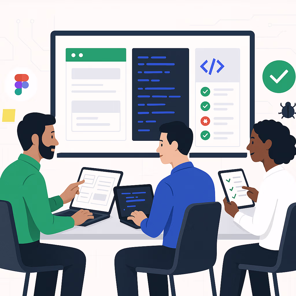
Engineering Handoff & Compliance
- Design handoff: Delivered a full design system (tokens + components) and a clean Figma file—each flow sectioned, variants/states documented, specs/redlines included.
- Build partnership: Worked with Engineering + QA on acceptance criteria and testing; shipped lightweight micro-interactions (skeleton loaders, smooth search results) without hurting performance.
- Quality gate: Dogfooded on staging across devices/browsers; fixed issues fast; signed off only after reliable end-to-end journeys.
- Compliance: GDPR data-minimization + RBAC; localization for DE/NL/FR/EN (expansion-tested); WCAG 2.1 AA—focus order, 44×44 targets, ≥4.5:1 contrast, ARIA landmarks.